Typography

Breton has several specificities in terms of its writing. On this page, An Drouizig presents on this page the specificities of Breton writing as well as, secondly, examples of typographies used as Breton typography.

Breton writing

Crossed K

Typographie bretonne - K Barré en breton

The crossed K is a letter used in Breton and Latin, formed of a K with a bar inscribed across it diagonally. They can be seen in civil status records for toponyms or surnames: Ꝃjézéquel for Kerjézéquel, Ꝃmoisan for Kermoisan. Since 1955, the general instruction on civil status prohibits it and considers it a “manifest alteration of spelling

In surnames

(extract from http://www.jtosti.com ).

A number of surnames begin with K’. They are all of Breton origin, and K’ (k crossed out, which can also be written k/) is an abbreviation of Ker (= hamlet, village). So, K’dual designates the one who is from Kerdual, name of many hamlets in Finistère, but especially in Côtes-d’Armor and Morbihan. In the same way, we meet the surnames K’Bourch, K’Danet, K’Delant, K’Divel, K’Dual, K’Gall, K’Hervé, K’Ignard, K’Jan, K’Morvan, K ‘Nevez, K’Ouas, K’Oullé, K’Ourio, K’Ros, K’Suzan, K’Varec, K’Vella, K’Vern. All of them are quite rare, but there are many K’Bidi and K’Bidy in Reunion, which could correspond to Kerbidic (name of two hamlets in Morbihan).

Prohibition of the crossed K

In the book Le K barré d’hier à aujourd’hui by Yann Riou (Lambaol association, town hall of Lampaul-Plouarzel, 29810), published in 1992, the author indicates that a judgment of the Council of State would have ordered the removal of the crossed K in official acts around 1895.

A letter from the Minister of the Navy and the Colonies to the Maritime Authorities dated April 19, 1881. “Prohibition of K/, for the spelling of proper names in official correspondence” […] This mode of proceeding that could lead to confusion and make searches in directories, alphabetical tables, archives, etc. more difficult. I have decided that the K/ will no longer be used in any official correspondence, personnel numbers, booklets, documents periodicals etc […] [Nailed. (Official Bulletin of the Navy 1880-1883 Volume 13)]

The consideration of crossed K by Unicode

Interview with Ken Whistler, Technical Director of the Unicode Consortium, by Patrick Andries. “Some Bretons complain about the absence of the crossed K and of unique characters to represent CH and C’H…”.

In March 2008, Unicode 5.1 finally defined the characters of K Barré.

LATIN SMALL LETTER K WITH DIAGONAL STROKE, (U+A743)

LATIN CAPITAL LETTER K WITH DIAGONAL STROKE, (U+A742)

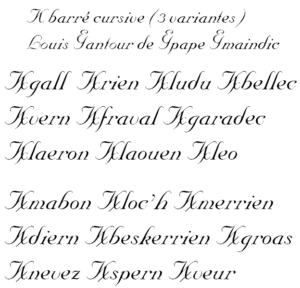
An uncial typeface, KELT UNICODE, takes this Breton particularity into account. It contains two typographical variants.

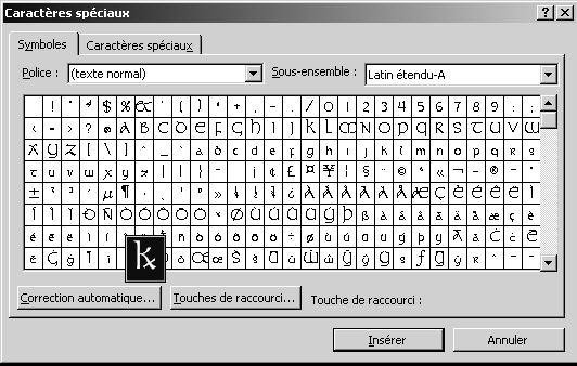
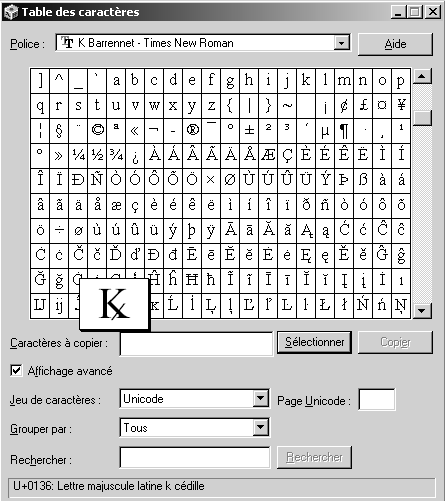
To install it, copy this file into the c:\windows\fonts directory. To access this character in your application, you will need to select the KELT UNICODE font then insert this character using the Insert > Special Characters command from the main menu of Microsoft Word, for example, or using the “Character Map” program (Start command > Run… charmap.exe).

Typographies bretonnes - Police qui intègre le K Barré - Typography - Tipografiezh
Typography - Tipografiezh

Another typography: the KB CURVE, cursive, imitates the old typography on marriage certificates, birth, etc.

Exemple de typographie intégrant le K Barré

Other typographic families include the crossed K: Junicode, Quivira, Code 2000, Everson Mono

If you have specific needs, the Korvigellou An Drouizig association can complete any typeface, preferably royalty-free. We will include this Breton character, the general appearance of which will be based on the capital K of your font. Please contact us by email.

Breton fonts ?

It can often happen that we are looking for a typography, created in Brittany and linked to Breton cultures, which evokes Bretonness, and that we find ourselves faced with a reduced number of choices. It is not new: since the 20th century and the generalization of printed media in the population, various solutions have been found to compensate for this lack. This research has also been the subject of the book Skritur by Fañch an Henaff.

The use of uncials

What is an uncial?

The uncial is a specific spelling of the Latin and Greek alphabets used from the 3rd to the 8th centuries. It was created from capital letters and ancient Roman cursive. It is the writing par excellence of the codices, adapted to the pen. At the beginning of the 9th century, the tiny caroline tends to replace it and it is no longer used except to trace the beginnings of books, chapters or sections, like our capital letters. The printing press has definitively made it disappear from common usage. Half-uncials, which gave rise to the Irish and Anglo-Saxon insular scripts, come not from the uncial but from the new Roman cursive and national scripts developed after the fall of the Roman Empire. [Source]

Historically, the uncial is therefore not particularly Breton and relates rather to the Middle Ages of Western Europe. However, we see it frequently used to evoke the idea of Bretonness. Because in truth, it is the repeated use of a typeface and not its historical or geographical origin that creates its identity. Thus, the Libra, Belgian typography, is seen as a typically Breton typography after having been used many times since 1930 in the Breton press. In the same way, typographies like the Vulcain (or any other geometric typography referring to the Art Deco movement) are seen as Breton, following their repeated use by the Seiz Breur.

Onciale irlandaise - Typographies bretonnes - Typography - Tipografiezh

Examples of the use of uncials as Breton typography

Typographies bretonnes - Les onciales comme typographie bretonne - Typography - Tipografiezh
Les onciales - typographies bretonnes - Typography - Tipografiezh
Onciales dans les typographies bretonnes - Typography - Tipografiezh

The Libra

Libra font is emblematic of this use of uncials as Breton typography.

The LibraBreizh typeface, originally designed by the Plantin foundry in Antwerp, appeared in Breton publishing in the 1930s. Its success has never wavered since and there are many uses for it. still in Britain today. We cab frequently find it on the signs of creperies, restaurants, pubs, car garages, Celtic bookstores, publishing… It is of Irish inspiration and its characters are very similar to uncials.

The “LibraBreizh” font manages all the diacritics of the Celtic languages, accented ŷ ŵ ẅ ÿ in Welsh, ñ ù ê â û ü in Breton, dot-in-chief characters in Old Irish… in the image of 40 other Celtic fonts. A Libra font (ie LibraBreizh without the full set of diacritics) can be downloaded.

Examples of the use of Libra as Breton typography

Typographies bretonnes - exemple de Libra
Exemple d'utilisation de LibraBreizh dans les typographies bretonnes
Typographie Libra sur un commerce - Typographies bretonnes
Enseigne de magasin - typographies bretonnes
Typographie bretonne - La Brito de Fañch le Henaff
https://www.skritur.eu/article/brito-tri

Brito by Fañch an Henaff

The most accomplished example of truly Breton typography that exists to date is the Brito created by Fañch an Henaff. It is the fruit of long research on the history of typography in Brittany. Apart from the fact that it was actually created in Brittany for Breton (or other) cultural media, it can be used both as a title and as the body of the text, something that is not allowed by the decorative side uncials.

Brito is characterized by the acute form found in each letter or sign. It is the tip of the reed, the carved reed of the first scribes on the clay tablets. There are 350 glyphs in different sizes and weights, thus covering the characters of several languages. It also has the particularity of allowing automatic writing of ligatures typical of Celtic languages, such as Breton C’H or GW, Welsh LL.

Brito was digitized and stabilized in 2011 with the help of Yoan De Roeck and Malou Verlomme. To date, it is unfortunately not available for web publications. Its license only allows use on printed media, and, if necessary for web illustrations, on jpg or png images.

It is also chargeable. You can buy it on Fañch an Henaff website.

Typographie Brito - Typographies bretonnes

Spotka Alternate by Xavier Dupré

Another typography intended to represent Brittany, the Spotka Alternate, designed by Xavier Dupré. This is the typography of the Brittany Region logo.

   Spotka Alternate

  Spotka

logo-rannvro-breizh    Rejion Bertègn : un logo en gallo pour la Région Bretagne ...     Bretagne (région administrative)

Resources about Breton typography

Here is a short bibliography on Breton and Celtic typography.

  • « Skritur », Fañch Le Henaff
  • « Le Manuel complet de typographie », James Felici, Franck Romano.
  • « Celtic Art, the methods of Construction », George Bain.